Custom layout
A custom layout is a fullscreen view that can be built to your liking.
This feature allows you to fully customize the mixer view to match your workflow and create new layouts for many different purposes (e.g. fixed installations).
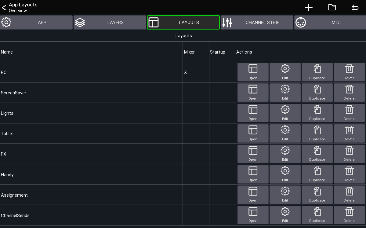
In the layout overview (show above) you can see all layouts currently loaded. From here you can edit and open them.
Templates
If you don't want to dive into the layout editor just yet, you can choose on of the templates to quickly adjust the apps mixer to mimic the layout of some other familiar apps.
Pressing a template will create new layout entries automatically.
Quickstart
- Open the menu of the main view
Menu -> Setup -> Layouts- Press the
+menu entry to add a new layout - Add and move UI items to your taste
By default, the first custom layout you create will override the mixer layout.
If you want to go back to the app's default, simply delete your layout.
Behaviors
A layout can be configured to have different behaviors, which are displayed in the Behavior column in the
screenshot above.
Mixer: A layout with this behavior will replace the default mixer layout of the app. This is usually the first view that you see after connecting to a mixer.Open on start: The layout will be opened directly after connecting to your mixer. You'll be able to press the back button to return to the mixer view.Default: The layout must be opened manually using a custom button or via the layout entry shown above.
Terminology
- UI item: An UI element that can be placed onto a layout (Buttons, Knobs, Channel strips, ...)
- Action: Defines what a UI element should be controlling (for example Mute, Fader level, ect)
The following describes how layouts, UI items and actions correlate to each-other.
Navigating
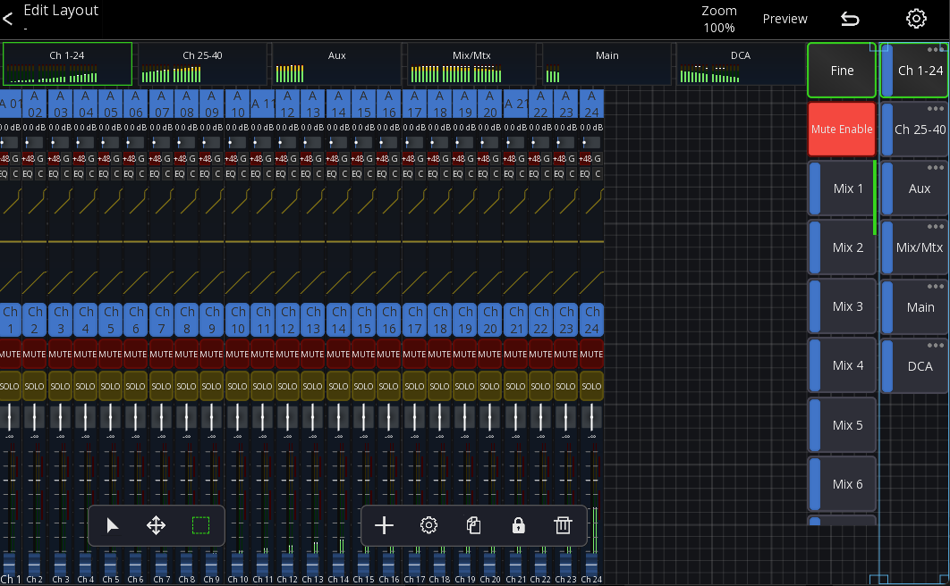
The layout editor has 2 action bars at the bottom of the screen. The left one controls the touch/mouse behavior and the right one is for the currently selected UI item.
Move and Resize
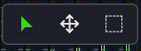
You can simply drag items to move them to another position. To resize an item, simply drag them from one of their edges, as indicated by the rectangle in each corner of the selected item.
When dragging on an empty spot the view can be panned around.
Panning and Zooming
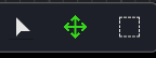
The tool in the middle lets you pan the layout around by dragging anywhere on the screen.
You can also pan and zoom by placing 2 fingers on the screen. On desktop systems you can press and hold spacebar, or middle mouse button to enable pan mode.
To zoom you can use a 2-pinger pinch gesture or the mouse wheel.
To reset your zoom and pan press the "Zoom" entry in the top menu.
Selection Mode
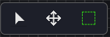
in selection mode you can drag on the screen to select multiple UI items at once.
On desktop systems you can press and hold shift to enter this mode.
Editing a layout
Context menu
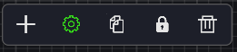
The context menu at the bottom of the screen provides actions for the currently selected UI item. From left to right:
- Add new UI item
- Open settings menu
- Copy
- Lock/Unlock
- Delete
Edit a UI item
To edit a UI item select it by pressing on it. Then press the gear icon in the bottom menu.
This will expand the UI item settings menu on the right hand side of the screen:
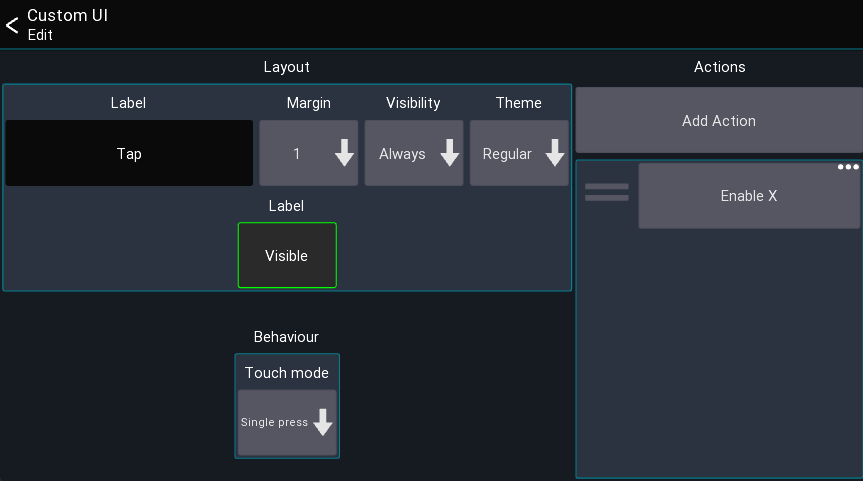
In there you can configure all settings for the currently selected UI element such as text, color and the assigned actions.
A more detailed explanation is below in the section UI item settings
At the top of this menu you also see some additional actions:
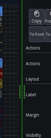
- To back/front can be used to move the UI element behind/in front of other UI elements.
The right side menu can be resized by dragging the vertical separator line:
Layout Settings
While in the layout editor, press the gear icon in the top menu to open the layout settings as shown below.
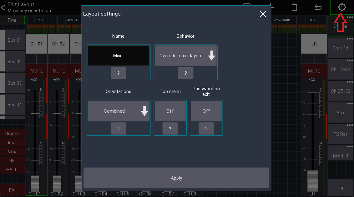
Here you can rename your layout, or change the general behavior.
Name
The name that should be used for this layout
Behaviour
See section Behaviors at the top of this page.
Read-only
Makes the entire layout read-only, preventing any user input.
Password on exit
Enable to prompt the user for a password before allowing to exit the layout. This can be used for fixed installation purposes where the regular user should only have access to pre-defined layouts, and only certain people should be allowed to access the rest of the app.
This is only relevant for layouts not using the override mixer layout behavior.
Top Menu
Indicates if the top menu should be shown. This is only relevant for layouts which are not using the override mixer layout
behavior.
UI Item Settings
This section describes the settings available for the UI items.
Note: Some UI elements may have more or less settings than the ones described here.
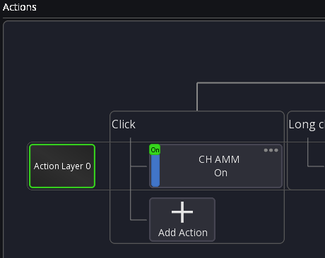
Actions
Shows all actions assigned to the UI item. Click on an entry to open the action, press and hold an entry to
remove it. See actions page for more details.
Label
The label is the text that should be shown on the UI element. You can use action tags to build labels that change based
on the current value, for example:
[label] [value]. All available tags can be found on the actions page.
Margin
Defines how big the margin should be of the UI element
Visibility
This setting controls the conditions under which the UI is visible.
| Visibility | Description |
|---|---|
| Always | Item is always visible |
| Only SoF | Item is only visible if SoF is active |
| Not SoF | Item is only visible if SoF is not active |
UI items
An (incomplete) list of the available UI items
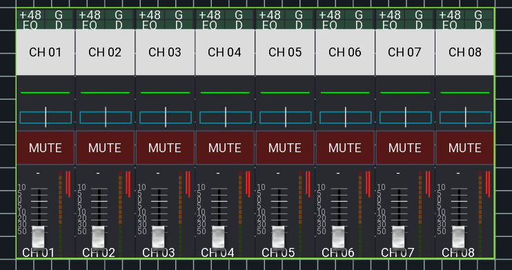
Mixer
Shows all channels of the currently active layer. This also includes the meterbridge (if enabled in the app settings).
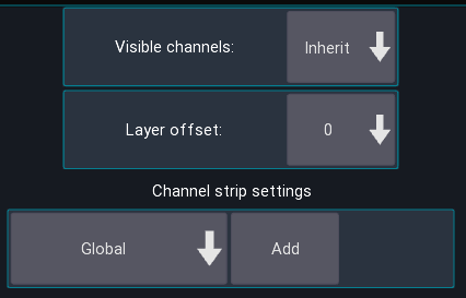
Visible Channels
Defines how many channels should be shown, by default it uses the value of your layer settings.
Layer selection group
Configures which active layer selection should be followed. This allows you to build mixers which have multiple independent layer selections.
Layer offset
Changes which layer is currently shown, relative to the currently selected layer. You can use this to build up rows of mixer elements, each showing a different layer.
Channel offset
Shifts all channels in the current layer by the selected amount.
Channel Strip
Defines how the channel strips should look. By default, the global preset is used.
Channel strip
Shows a single channel strip that can be assigned to a fixed, or dynamic channel (for example the current bus master).
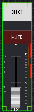
Similar to the mixer element, the look of this item can also be configured to be independent of the global channel strip settings.
Sidebar
List of buttons for controlling the sends on fader, fine and mute enable status.
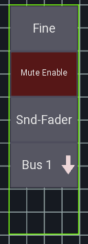
Sends on fader buttons
List of buttons for controlling the sends on fader state
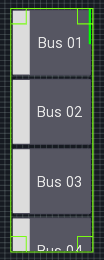
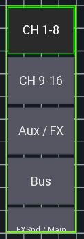
Layer list
List of buttons for selecting a layer.
Button
A button can be used to toggle the status of an action.
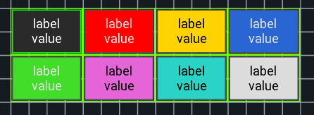
Action slots:
| Slot | Behavior |
|---|---|
| Click | Finger needs to touch and lift |
| Long click | Finger needs to touch for a longer period |
| Touch | Finger needs to touch |
| Momentary | Touch triggers "on", lift triggers "off" |
| Inv. Momentary | Same as Momentary but inverted |
Knob
A knob can be used to control a numeric value (like a send level or pan).
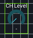
Label
A label can be used to show values like the current scene, or just to display text.
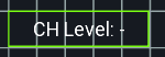
Settings: Text position
Changes how the text is aligned on screen.